- Client: University of Kent
- Lead Contractor: Kier Group; Architect: Penoyre & Prasad
- BIM Tools: ArchiCAD, BIMx
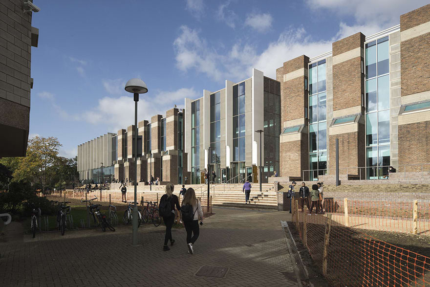
A substantial two-phase extension and refurbishment has transformed The University of Kent’s Templeman Library into a flagship learning centre.
Architectural practice Penoyre & Prasad extended and refurbished the existing building to create a contemporary learning space, while emphasising the library’s pivotal role within the Canterbury campus.
The extension to the library includes an open access teaching floor with a 250-seat lecture theatre, eight seminar rooms, a conference and resource facility, a cafe, exhibition space, a specialist archive and a variety of study spaces.
The extension also created a hub for the university campus by opening up a pedestrian connection across the site and through the refurbished library block.
The refurbishment part of the project was completed over two subsequent phases allowing full connectivity between the new learning centre and the archives/reading rooms of the existing library.
Fulfilling multiple client needs
Constructed during the 1960s and 1970s before being extended in the 1980s, the original library accommodation was deemed unfit by the university to fulfil the needs of a growing campus. The insulation and glazing were inadequate, there was poor circulation of students around the library and a lack of connectivity between different campus buildings.
The university required larger spaces, theatres and workshops as well as private study areas. Penoyre & Prasad led an extensive consultation with staff and students to design 1,800 individual, pair and group study areas. In addition, requirements included specialist spaces such as the new archive, which needed to be temperature and moisture controlled.

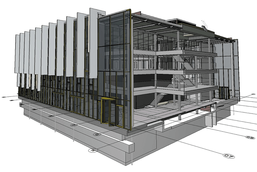
Penoyre & Prasad initially modelled the existing building from 2D surveys. A 3D model was then created in ArchiCAD
Ana Matic, associate partner at Penoyre & Prasad, explains: “Throughout the extension and refurbishment, the library needed to remain open and accessible for students and staff so we had to carefully manage the work to ensure access during this time.
“We consulted with a diverse client group throughout the project, who had different views and expectations. It really helped to be able to show the client our designs in 3D, as well as visuals and interior rendering. At this stage, both ArchiCAD and BIMx were invaluable as briefing tools.”
Visualisation to share ideas
At the early design stages, Penoyre & Prasad shared options for the facade materials and for interior designs with the client using ArchiCAD and renders created in-house. In addition, the team displayed a BIMx model at an exhibition to enable students and staff to navigate and explore the future extension.
This sharing process continued when the BIM model was used to help the client choose important elements of the internal finishes, including library furniture, fittings and lighting.

The extension to the library includes an open access teaching floor and a 250-seat lecture theatre
Matic says: “We used BIMx to brief the client and show them around the design on briefing days. It was very useful to help the client to visualise the spaces, especially the junctions between the old and new buildings.
“Architects can see what a space will look like in their heads – BIMx helps us to share this vision with our clients. We used Artlantis and ArchiCAD for the renders and also created a lot of interiors using ArchiCAD and Photoshop, which was very quick to do.”
Putting ArchiCAD and Teamwork to the test
The project was run using Graphisoft’s Teamwork, with up to 10 staff collaborating during busy periods and all benefitting from the automated co-ordination inherent in a model-based workflow.
“Templeman Library was our first ArchiCAD project, it was a substantial assignment and we ran it from start to finish using ArchiCAD,” says Matic. “Using Teamwork, being able to coordinate complex elements of the design, such as the curtain walling with the concrete fins and the internal structure, was vital.”
Penoyre & Prasad now uses the project internally to demonstrate best practice for modelling, template creation and organising 2D output.
Collaboration and communication
Penoyre & Prasad worked with structural engineer Price & Myers, main contractor Kier Group and architectural concrete specialist Decomo.
A key element of the design was external cladding fins. These were created in pre-cast concrete by specialist Decomo and had to be manoeuvred into place in one go. The curtain walling facade with the concrete fins was developed concurrently with the engineers’ structural models and Penoyre & Prasad worked closely in 3D with both Price & Myers and Decomo to ensure everything went to plan.

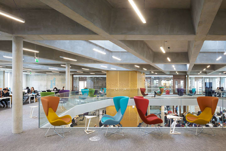
The library features silent study areas
“Collaboration in this way was very advanced for the time,” adds Matic. “One of the great things about ArchiCAD is that you don’t need a third-party software to be able to collaborate – you can work on everything directly within the model. We held the federated BIM model in ArchiCAD and directly imported other parties’ models.
“We stayed in touch with the construction team throughout the build and were on hand to resolve some tricky junctions and coordination. We exported schedules, DWGs and PDFs directly from ArchiCAD to provide the contractors with the detailed information they needed in their preferred format.”
The benefits of BIM
For Penoyre & Prasad, BIM helped unleash a new level of creativity and daring design.
“One of the biggest benefits of BIM was that it helped to push the design further than we would have gone before,” says Matic. “Working in 3D, we were able to formally introduce things that were slightly more extravagant. And by collaborating closely with our structural and mechanical engineers, we were confident we would get it right.”
For the refurbishment, Penoyre & Prasad initially modelled the existing building from 2D surveys. A 3D model was then created in ArchiCAD, which the practice worked from.
“With old buildings you often don’t know what you’ll find until you start to knock walls down. We used ArchiCAD’s renovation filters to the absolute maximum,” explains Matic. “We also used the model to layer different elements for the structure, M&E, furnishings, finishes – usually creating separate models for each package or discipline.
“ArchiCAD helped us to deliver a flagship building for the university. We were able to look at many different iterations and explore millions of options to find the best solution for every space and detail.”


